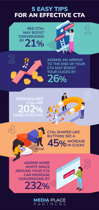
5 easy tips for an effective CTA

There are few things more important for your ad or landing page than a call to action. Without an effective CTA, an ad is just a pretty picture! A CTA shepherds your audience to where you want them to go and is the bridge between your campaign and the conversions you seek. So, it’s crucial that you carefully consider your CTA as you plan your advertising campaign. If you treat the CTA like an afterthought, your results will show it. But sometimes it’s hard to think of something other than the standard “learn more” or “sign up” or “click here.” You know you need an effective CTA – but how do you get there?
Not to worry – we’ve compiled these 5 easy tips you can use for a more effective CTA. Each one has data to back it up. Let’s dive in:

Effective CTA tip #1: Red CTAs may boost conversions by 21%.
Color can evoke strong feelings. Some colors have such strong associations that we feel something before we can even put words to it. Case in point: green means go, red means stop. A green CTA should make people think “go” and click. Right? Well, Hubspot put this exact theory to the test, creating two landing pages that were completely identical except for the color of the CTA button. In the end, it was the red CTA that outperformed the green – by a whopping 21%.
In a way, this makes sense – red often means “stop,” yes, but it also means excitement and passion. It’s less common than green on websites, and it is known to catch the eye. Does this mean that you should rush out and change all of your CTAs to red? Not necessarily – but it does mean that you should consider it, and perhaps run an A/B test of your own.
Effective CTA tip #2: Adding an arrow to the end of your CTA may boost your clicks by 26%.
As you develop your ad campaigns, you likely think in terms of the customer journey. There’s a specific path you want people to follow as they move through your sales funnel. It turns out that making this “journey” feel a little more literal by simply adding an arrow to your CTA can actually boost conversions! Helzberg Diamonds, working with Digital Evolution Group, found that users were 26% more likely to click on their CTA when an arrow icon was added. It’s a small change, but it helps guide the user along and it can have powerful results. Why not give it a try?

Effective CTA tip #3: Personalized CTAs are 202% more effective.
In the digital age, where consumers are bombarded with marketing messages, it’s crucial to stand out from the crowd and capture attention effectively. Personalized CTAs offer a powerful solution, outperforming generic CTAs by a significant margin. Unlike generic CTAs that use a one-size-fits-all approach, personalized CTAs tailor the message to the individual user’s interests, preferences, and behavior. This personalized touch creates a sense of relevance and connection, making the user feel like they are being addressed directly rather than being treated as just another number. As a result, personalized CTAs resonate more deeply with users, increasing the likelihood of engagement and conversion.
Effective CTA tip #4: CTAs shaped like buttons see a 45% increase in clicks.
If you’re thinking that this article seems less about marketing and more about psychology…you’re not entirely wrong. The fact is that small changes can have a profound impact on how your audience behaves. We’re all used to clicking on text links, but simply adding a button shape to your CTA can make your audience more likely to click through!
CTAs shaped like buttons perform better for several reasons. First, they are instantly recognizable as clickable elements, making it clear to users that they can take action. Second, their visual appearance suggests interactivity, inviting users to engage with the call to action. Third, the use of buttons creates a sense of urgency, as users are often conditioned to respond promptly to clickable elements. In contrast, text-based CTAs can be easily overlooked or misinterpreted, as they may not stand out from other text on a page.

Effective CTA tip #5: Adding more white space around your CTA can increase conversions by 232%.
When you’re trying to sell, there can be a temptation to add more and more details. But sometimes, what you need more than anything is a little breathing room. If your site or ad is too cluttered, there’s a chance your audience might miss seeing your CTA entirely. The last thing you want is to drive people away with distractions. Instead, make sure it’s easy to focus on your CTA by adding some white space around it. This will help ensure that your CTA stands out and that it’s easy for your audience to know where they need to go next.

You don’t have to follow all 5 tips every time you make a CTA – they might not make sense in every situation. But next time you’re developing a campaign, refer to these tips and see what might take your CTA to the next level.


